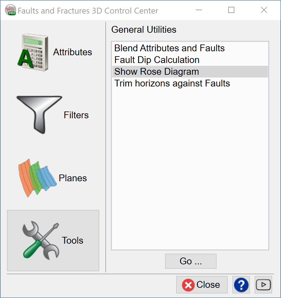
2.4.3 Show Rose Diagram
The rose diagram works similar to a histogram. It counts the number of samples which have a TFL value above the given threshold. The diagram is divided into 36 sectors, representing a 10 degree strike angle range.
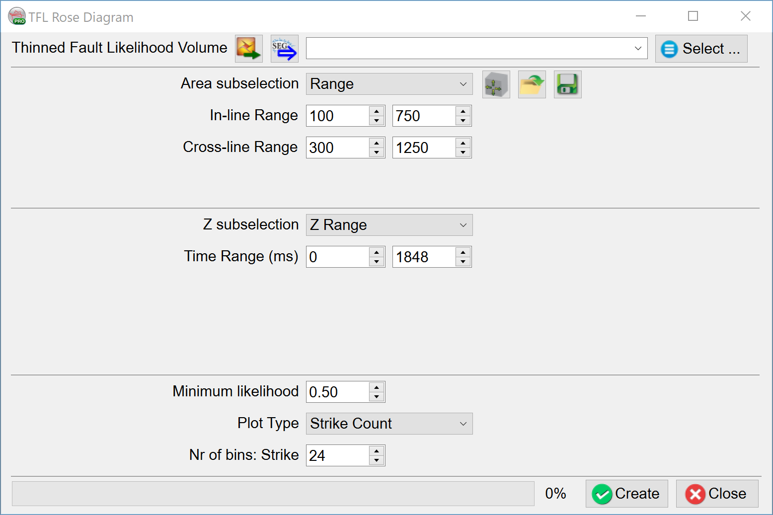
Two types of rose diagram are supported:
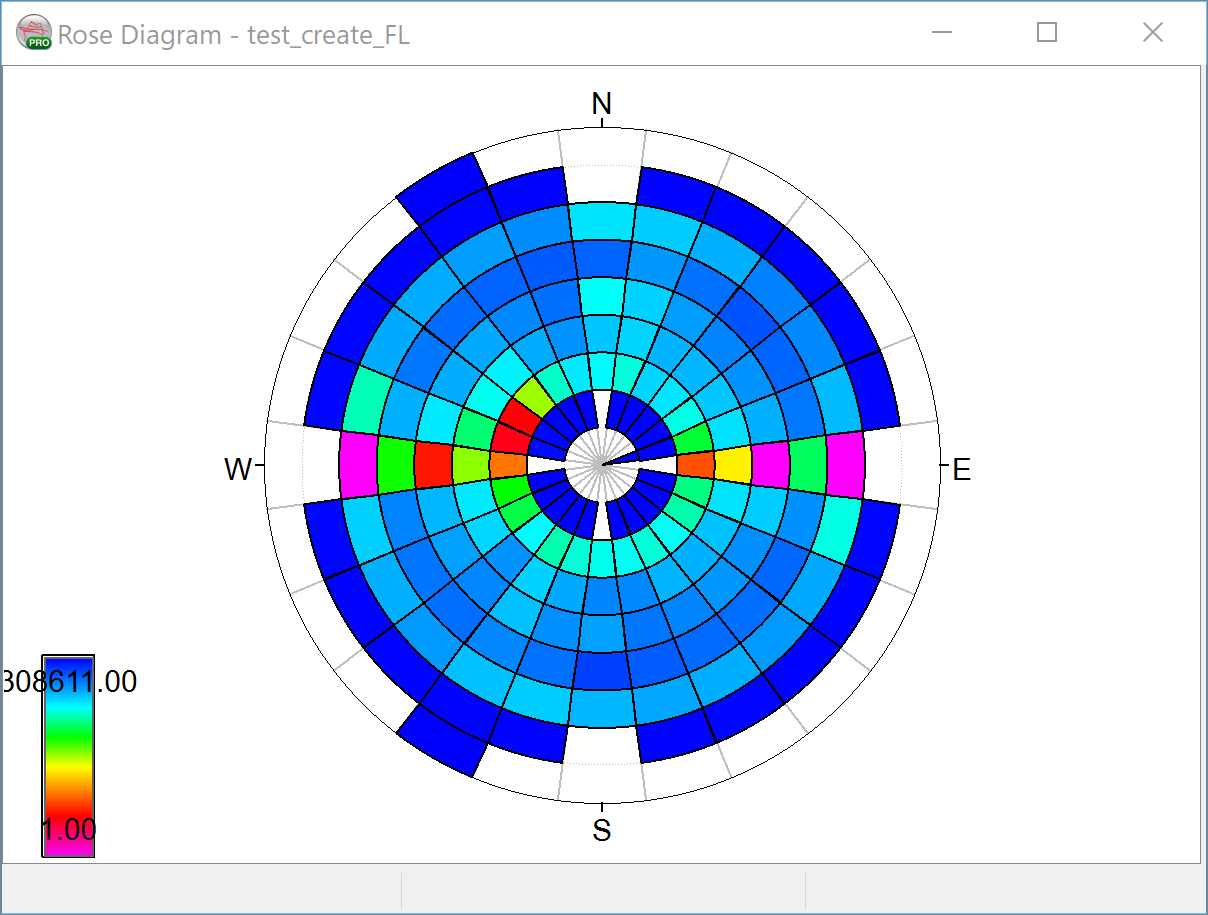
- The Strike Rose Diagram. This diagram shows the count (or number of samples) in each strike sector. The more samples in a certain strike angle range, the longer the bar. Therefore, the radius of the rose diagram represents the count.
- The Strike/Dip Rose Diagram. This diagram shows the count based on strike and dip direction. Each strike sector is divided into 9 dip angle parts, representing a 10 degree dip range. The radius of this rose diagram therefore represents the dip angle from 0 in the center to 90 on the edge. The color tells how many samples fall into a certain strike/dip sector-part.

An example of a Strike Count Rose Diagram.
An example of Strike/Dip Rose Diagram. It shows that the most of the faults/fractures have a North-South direction and have a dip angle between 60-80 degrees.